
| 일 | 월 | 화 | 수 | 목 | 금 | 토 |
|---|---|---|---|---|---|---|
| 1 | 2 | 3 | 4 | 5 | ||
| 6 | 7 | 8 | 9 | 10 | 11 | 12 |
| 13 | 14 | 15 | 16 | 17 | 18 | 19 |
| 20 | 21 | 22 | 23 | 24 | 25 | 26 |
| 27 | 28 | 29 | 30 |
- vscode
- CS
- Graph
- DP
- Redux
- 동적 계획법
- 그레이들
- Algorithm
- db
- java
- 백준
- BFS
- TypeScript
- 다이나믹 프로그래밍
- 안드로이드
- Database
- 알고리즘
- Python
- LeetCode
- 리트코드
- network
- 자바
- DFS
- Data Structure
- frontend
- git
- VIM
- react
- 프로그래머스
- Javascript
- Today
- Total
늘 겸손하게
CSS - Position (static, absolute, fixed, relative ) 본문
CSS - Position (static, absolute, fixed, relative )
besforyou999 2023. 10. 16. 17:51

Position 정의
CSS Position 속성은 요소의 positioning method type을 결정한다.
여기서 positioning method type은 요소가 화면에 어떤 위치에 배치될지 결정하는 방식을 말한다.
대표적인 CSS Position에는 static, absolute, fixed, relative 등이 있다.
설명을 위해 아래와 같은 html, css 로 예시를 들겠다.
html
<body>
  <div class="container">
    <div class="box">1</div>
    <div class="box">2</div>
    <div class="box">3</div>
  </div>
</body>
css
.container {
  width: 300px;
  background-color: lightblue;
}
.container .box {
  border: 4px dashed red;
  background-color: orange ;
}
.container .box:nth-child(1) {
  width: 100px;
  height: 100px;
}
.container .box:nth-child(2) {
  width: 150px;
  height: 50px;
}
.container .box:nth-child(3) {
  width: 80px;
  height: 140px;
}
위 css 코드를 간략히 설명하면
.container는 모든 박스를 감싸는 컨테이너를
.box는 box들의 기본 스타일을
nth-child(n)은 n번째 자식 요소의 스타일을 결정한다.
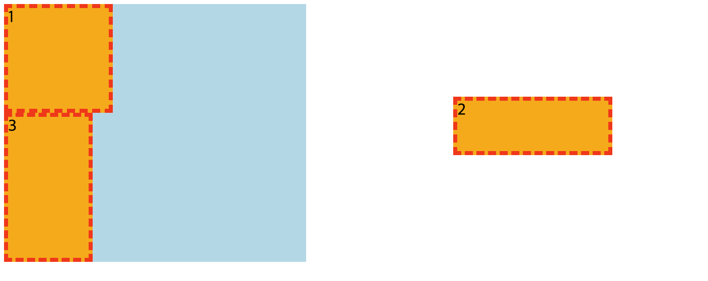
html를 브라우저에 로드하면 아래와 같은 그림이 나타난다.
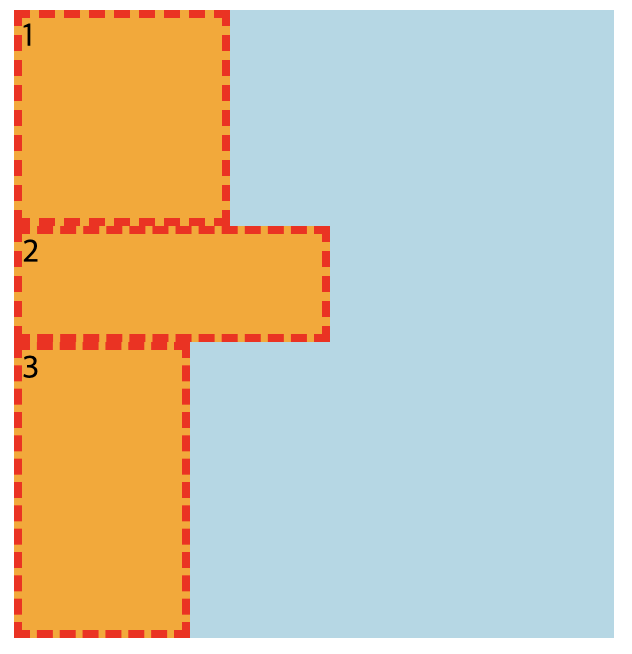
static
디폴트 값으로, 요소가 문서 흐름 그대로 배치된다.
CSS에 position 속성에 대한 코드를 넣지 않으면 자동으로 position: static 이 적용된다.
위 코드와 같이 div는 한 행 전부를 차지하려하는 특성이 있다.
해당 특성에 맞게 모든 박스는 자기 width, height에 맞춰 한 행을 모두 차지한다.
relative
위치 상 자기 자신의 위치를 기준으로 배치되는 속성
위 코드에서 2번째 자식 요소에 position: relative, left: 50px를 적용해보면
.container .box:nth-child(2) {
  width: 150px;
  height: 50px;
  position: relative;
  left: 50px;
}
다른 css는 동일
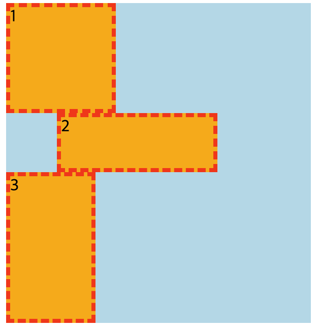
자기 자신의 원래 위치에서 왼쪽으로 50px(left: 50px)만큼 밀린 위치에 배치가 되는것을 볼 수 있다.
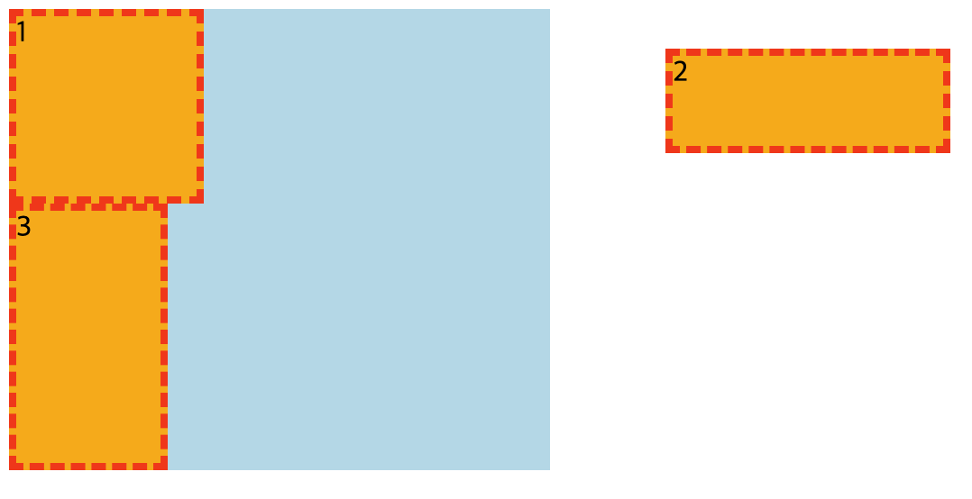
absolute
가장 많이 쓰이는 포지션 속성.
위치 상 부모 요소를 기준으로 배치 하는 속성
예시 코드에서 마찬가지로 두 번째 자식 box에 position: absolute를 적용해보면
.container .box:nth-child(2) {
  width: 150px;
  height: 50px;
  position: absolute;
}

박스 3번이 박스 1번 밑으로 이어붙어진다.
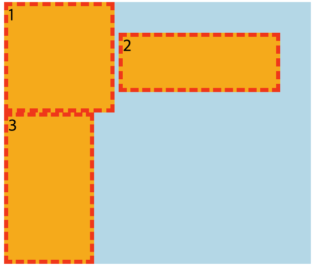
box에 top: 30px, right: 30px를 주면?
.container .box:nth-child(2) {
  width: 150px;
  height: 50px;
  position: absolute;
  top: 30px;
  right: 30px;
}
예상과는 달리 브라우저 뷰포트 기준으로 위쪽 30px, 오른쪽 30px에 요소가 배치된다.
부모 요소인 container 기준으로 위쪽 30px, 오른쪽 30px에 배치될것을 기대했으나 뷰포트 기준으로 배치가 된다.
그 이유는, container에 적용된 position이 없기 때문에 '위치 상' 부모 요소인 브라우저 뷰포트 기준으로 배치되는 것.
container에 position: relative를 주면 '위치 상' 부모는 뷰포트가 아닌 container가 된다.
.container {
  width: 300px;
  background-color: lightblue;
  position: relative;
}
fixed
브라우저 뷰포트를 기준으로 배치
.container .box:nth-child(2) {
  width: 150px;
  height: 50px;
  position: fixed;
  top: 100px;
  right: 100px;
}
'Programming > HTML,CSS' 카테고리의 다른 글
| HTML, CSS - Margin, Padding (0) | 2023.08.21 |
|---|---|
| Emmet 약어 사용 (0) | 2023.08.15 |
| CSS - Media Queries (미디어 쿼리) (0) | 2022.08.24 |
| CSS - 반응형 웹 디자인? (0) | 2022.08.24 |
| HTML, CSS - CSS 애니메이션과 JS 애니메이션의 차이점 (0) | 2022.08.09 |

